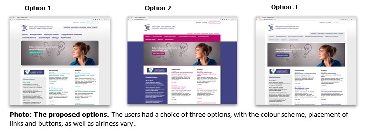
Option number one won with 39 percent of the vote. Option two was also liked by many, obtaining 34 percent of the vote. When asked specifically about the colour scheme, the pink option climbed three percentage points past the winner. Option number one appealed to the respondents with respect to the airiness of the layout, the sufficient size of the margins and the style of the links.
”We will adopt to use the winner, but at some point, we may refresh the look with a little bit of pink, which proved so popular,” promises Marjaana Maisonlahti, the Director of Teachers’ Unemployment Fund.
Users find the single most important element of the website to be the Openetti login. They want it to be in an easy-to-find place and clearly marked. The most favourite place was the upper right hand corner.
“This requested change will also be considered when the next steps are planned,” Maisonlahti notes.
Overall, the respondents hoped that the content of the website will be reduced with view to ensuring that the user finds quickly the content they are looking for. Many suggested that only the subject titles should be displayed on the front page, with additional information placed behind links. Someone remarked that a visitor to the website should find what they are looking for fast, to save their nerves.
Thank you to the respondents
”We wish to thank our members for their enthusiastic participation in the survey and their comments about the visual look. The website is for our members, and its user-friendliness is therefore very important to us, which is why we organised the vote,” Maisonlahti thanks.
We raffled two book tokens for Suomalainen Kirjakauppa among all respondents. The lucky winners in Pelkosenniemi and Viitasaari have already received their prizes.
Marjaana Maisonlahti Etta Partanen
Director Communications and Research Manager
Teachers’ Unemployment Fund Innolink Research Oy

